I talk about the importance of thumbnails, often. Why? Because they’re such a great (and easy!) way to optimize your existing Youtube videos. Why reinvent the wheel when you don’t have to? And as your Youtube go to gal 😉, I’m sharing three Youtube thumbnail tips to make them stand out.
The ultimate goal is to get your videos seen, and thumbnails are the first impression!
And because of that, we need viewers to click into our thumbnails so they can watch your value-packed videos.
Rather watch that read? Head on over to my Youtube channel where I give you all the deets.
1. Show your face
When creating a custom thumbnail, showing your face gives the viewer a chance to really connect with you before they’ve even watched your video. It gives them an idea of who is going to be teaching (and entertaining!) them – a sense for who they’re going to see when they click into your video. It also just makes your video content more personable because you’re able to display emotion through your photo.
😃You can smile
☹️You can have a frowny face
🙋🏼♀️You can look like you’re asking a question
With a photo of you in the Youtube thumbnail, you can really display any emotion that will entice your audience and make them click into your video.
2. Brighten up your image
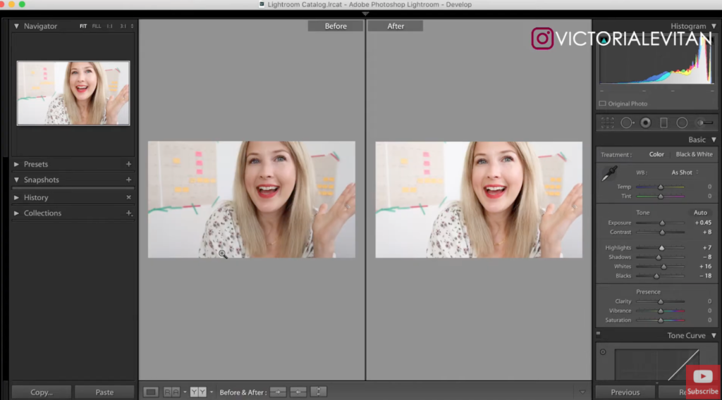
Creating custom thumbnails allows you to play with the aesthetics! You can of course make your image darker, or adjust other elements, but I always recommend brightening up the photo. Good lighting will make your Youtube thumbnail look so much more professional when you have it slightly edited with some brightness, saturation or contrast.
What exactly do I mean by that?
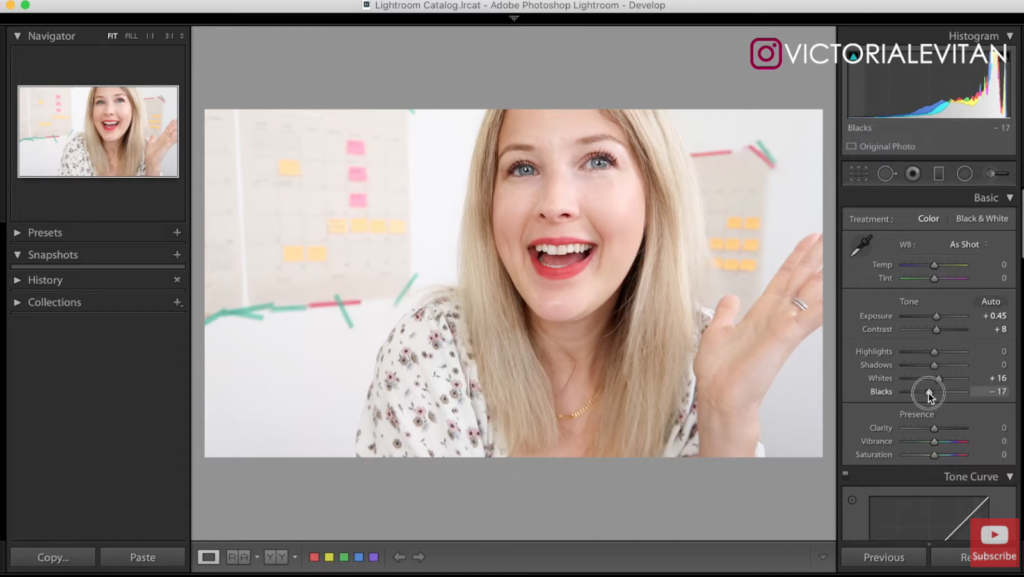
When I create my custom thumbnails, I take my image and drop it into an editing app (I use Lightroom but any photo editing app will work for this). I simply add brightness and contrast to the image so my image pops a little more on screen.
I specifically do this because I want to make sure that I have some more light on my face. Sometimes I film my videos in my living room where it’s quite dark, so my thumbnail may need some extra love to shine a bit brighter and stand out to my potential viewers.
3. Add text to your thumbnail
There are a couple of things you want to keep in mind when you’re adding text to your thumbnails.
First, you want to make sure that you’re not using the same text that you’re also using in the title of your video.
For example, if I called this video, “Three Tips to Create Your Custom Thumbnails,” I wouldn’t also use that same text in the thumbnail. I would instead call it something like, “Do this to create your custom thumbnail.” It would be very similar but have that slight variation to make it a little bit more interesting!
When you’re able to explain the same subject in different ways, you become more captivating to your viewer and avoid them just scrolling through your Youtube videos without engaging. Being able to dynamically explain something will hook them into the video!
And secondly, you don’t want to add too much text to your Youtube thumbnail.
Typically, a thumbnail displays your face on one side and your text on the other. However, you want to make sure that the text is easy to read. A lot of people watch Youtube on their phones so you always want to keep the “mobile first” mindset. Adding too much text can make it harder for the viewer to read it on a small screen.
Always make sure your thumbnail text is easy to read and that you explain what the video is about in a different way from what your title is called. I hope these tips help you in your Youtube thumbnail creation process!
PS: Be sure to subscribe to my Youtube channel so you don’t miss a new video every week! And DM me on Instagram if you have any questions or leave them in the comments below.


+ show Comments
- Hide Comments
add a comment