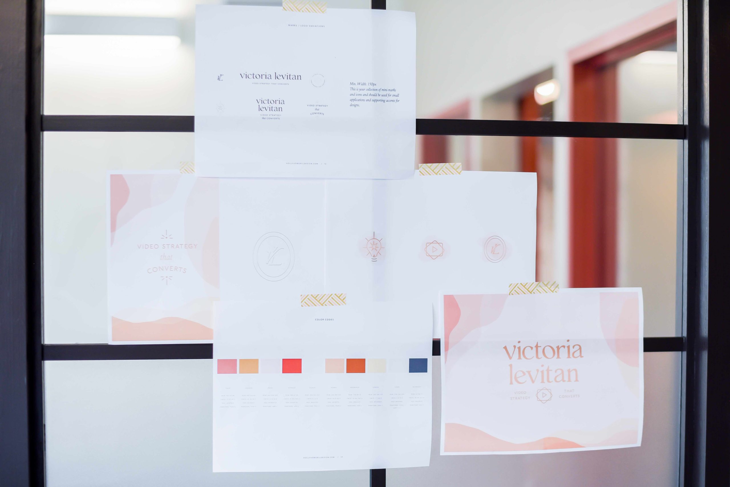
When I first started my business, I went on canva and created my logo from a template. I liked the colors and it was simple enough. In the beginning, my priorities were set on getting clients and not what colors go well with my brand. To be honest, I didn’t see the value in professional branding until I realized how much my old look didn’t match my business or core values.
Now, with two years of client work under my belt, I knew it was worth investing in professional branding. I wanted something that would reflect my personality and what it’s like to work with me. With 2020 shuffling around my priorities, it was a good a time as any to tackle this project.
Investing in Professional Branding
My designer sent me a comprehensive questionnaire to fill out. It covered questions such as what my mission statement is, who I serve, what I offer, my unique selling proposition, what style I’m going for, what attributes I’d describe my business with…You can imagine it took me a few days to drill down the specifics and that it sharpened my position of what my business is (and isn’t).
The other initial step was creating a Pinterest board with inspiration. I already had a color scheme in mind (warm colors) and knew I wanted a sticker element (they’re fun!). Once my designer reviewed my questionnaire and Pinterest board, she sent over 3 concepts.
Concept & Logo
We jumped on a call to discuss what I was drawn to in each, and then she combined those elements onto 1 final concept. The concepts were mock images and showed the general look and feel of what I was going for. Once we had that, we moved on to creating the main logos and sub-marks.
I had again 3 different versions to choose from and it was a fun process eliminating and adjusting design elements. It was at times difficult to make decisions, but I kept going back to what felt right in my gut and what I thought my clients would respond to.
The Big Concept Reveal
The logos and submarks were decided:
- horizontal & stacked logo options
- video play button + sticker to highlight my industry
- business tagline element
- lightbulb to highlight the strategy/coaching element of what I do
Now the fun part came where my designer crafted the color scheme, font options, patterns, and shapes. When she sent the PDF I was overcome with joy. The vision in my head had become reality and it blew me away. We removed a few elements that didn’t fit in well but overall, it was perfect.
A note here: We got rid of a few things not because I didn’t like them, but because of the way my audience might perceive them. That’s the biggest tip I can share, is to imagine how your ideal client might read into your visuals.
Brand Style Guide
After we cut a few elements and confirmed the final look, it was just a matter of receiving my brand style guide and design files. The style guide explains exactly how to use each element and is now part of my company guidebook. I know exactly what colors and fonts to use when creating new collateral, and most importantly, I can share it with confidence.
When I first signed up for this, I had no idea what to expect. I didn’t think creating a visual identity would be so formative for my business. I would still recommend only investing in professional branding once you are a few years in, but boy is it worth it.

+ show Comments
- Hide Comments
add a comment